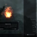

Main Font Replacement
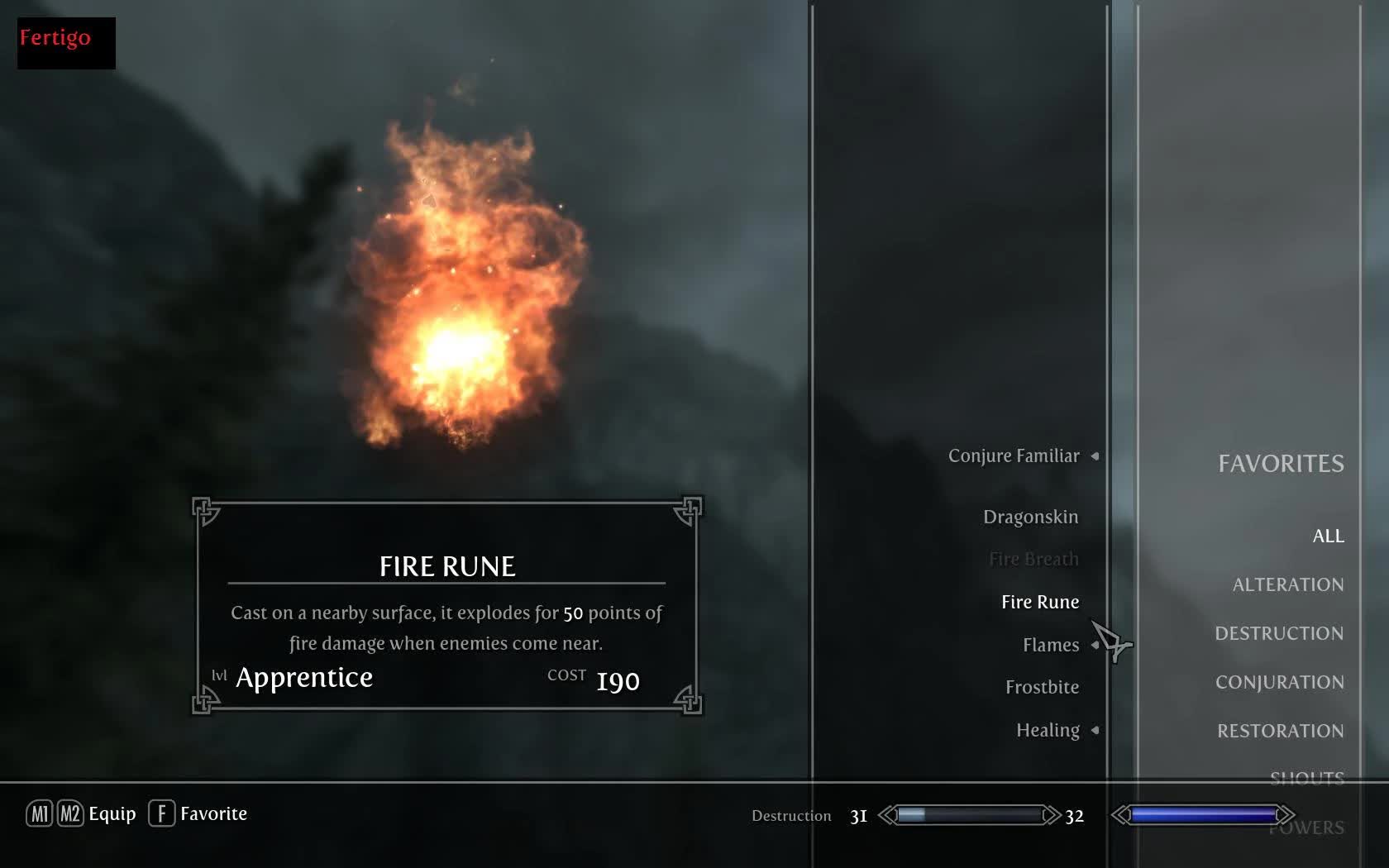
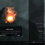
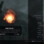
Replaces the Futura font, the one used for the main UI elements, now with less runoff.
Drop the files (for one font only) in your Data/Interface folder. Naturally, if you’re using a modified fontconfig.txt already you’ll have to manually merge the old and the new. Delete them to go back to the default font, no game files are modified.
Replaces the font used for the main UI elements with a selection of less modern fonts. Some are a bit less condensed and bigger. There may be clipping or run off issues. The only place I am certain font gets cut off is the second line of shouts, Unrelenting Shout, for some fonts.
For smaller fonts, “lockpicks remaining” and the journal font are relatively small. At this point I dont really plan to try and fix anything. Basically with some fonts you wont get all of the shouts description, and the journal font is pretty small. These bother me little enough that I’ve beat the game, so it appears I’ve moved on. I’m sure Darn and Co. will release a complete UI revamp eventually, once its done. Suggestions are still welcome though, who knows. Definitely not creating new fonts though.
If you want to use your own font, embed it in a .swf file and set the font name in fontconfig.txt. In Adobe Flash Pro you just insert a text box, select the font, and hit “Embed Font”, basically.
I may have gone a bit overboard with shrinking Morpheus and Centaur for the new batch, not sure. The – Large variants are still available.
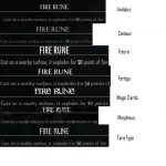
My comments on each font:
Andalus: Generic. Very small. Should be absolutely minimal clipping, but potentially hard to read for some. Shout does clip.
Centaur: Generic. Small. Should be minimal clipping, but again, potentially hard to read. Shout does not clip. The “Old Centaur” is a bit bigger.
Fertigo: Generic, bolder/blockier. Should be easy to read. Shout does not clip.
Magic Card: Fantasy-esque, fairly large. May be clipping in some places. Shout does not clip.
Morpheus: Fantasy-esque, somewhat small. Might clip in places, this font seems to like doing that. Shout does clip.
TaraType: Generic with a funky A. Might clip some. Shout does clip.
The lack of manly-nordic font is due the Skyrim’s grumpy character scaling. The characters just dont fit and I’m not about to manually resize every UI element. Tried everything I can imagine to make half a dozen fonts behave ‘correctly’. How Skyrim scales them appears to have little to do with glyph size, with Unrelenting Force being a good example. No amount of font shrinkage will make the second line of the description appear with some fonts. I’ve fiddled with every property and table I could find, no luck.

